Website:
DEATH IN CAMBODIA, LIFE IN AMERICA PODCAST
-
The "Death in Cambodia, Life in America" podcast aims to educate, inspire, and heal by sharing in-depth firsthand experiences of the Cambodian Genocide (1975-1979), emphasizing resilience and the value of life. It explores the Khmer Rouge's impact, survivor stories, untold narratives, community solidarity, and the overarching theme of resilience. Through these discussions, it seeks to offer a comprehensive understanding of this tragic period, highlight the power of the human spirit, and honor the memories of those affected.
-
The original website did not effectively convey the depth and emotional gravity of the podcast's content. It needed a design that would attract and retain listeners, encouraging them to explore the episodes and learn more about the podcast's themes.
-
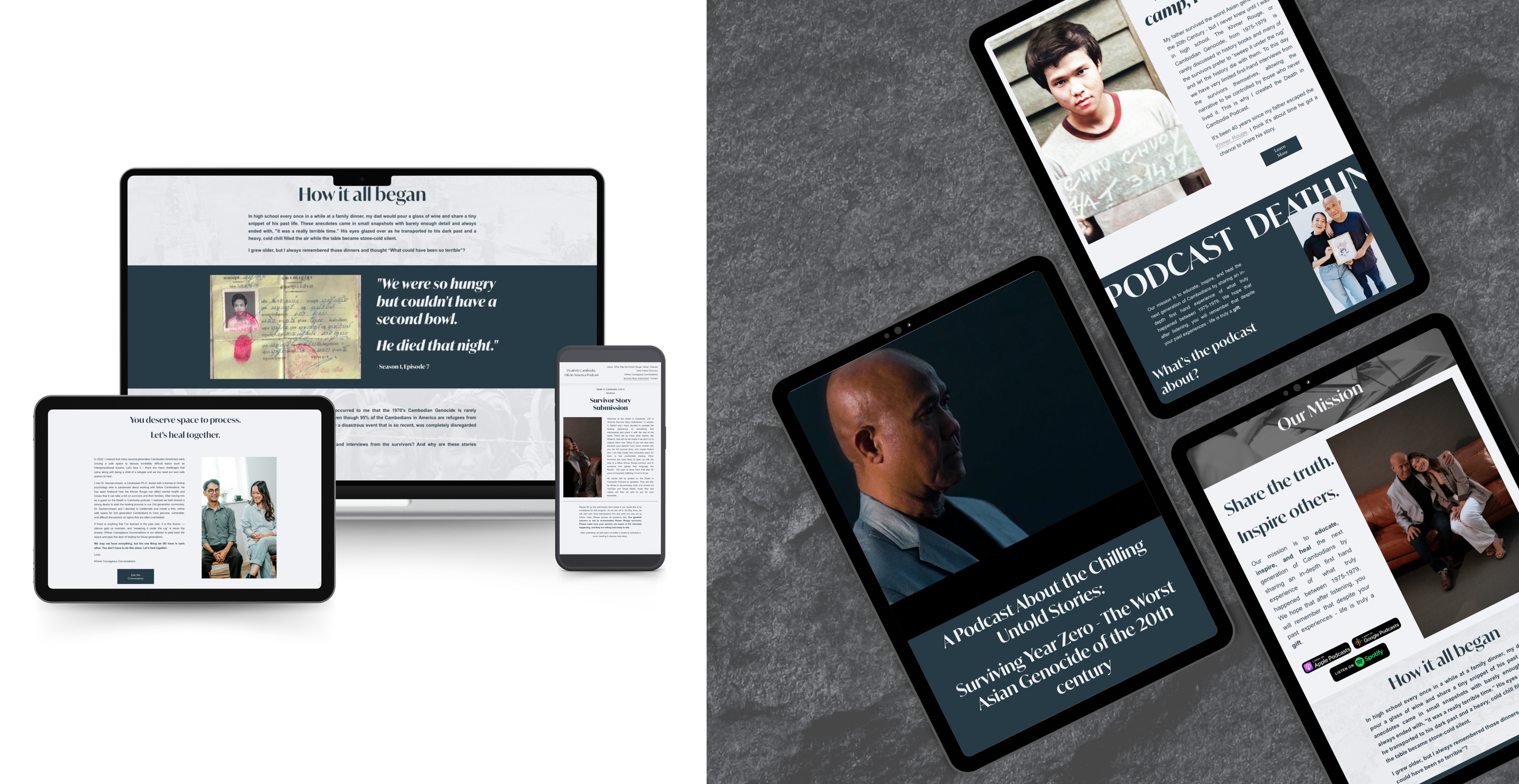
The redesign focused on creating an immersive experience, with a visually compelling layout that incorporates elements reflective of the Podcast’s core values and mission. The user interface was simplified to improve navigation, making it easier for visitors to access episodes, learn about the podcast's backstory, and engage with supplementary content. SEO strategies were implemented to increase visibility and attract a wider audience in efforts to grow the podcast and continue expansion with the brand.
-
The revamped website significantly boosted the podcast's online presence, resulting in increased listener engagement and higher episode downloads. The site now effectively communicates the podcast's mission and values, supporting its goal to educate and inspire a diverse audience about the Cambodian experience and diaspora.

“Luneer and Brandi's team was the only team I would have wanted to rebuild my Death in Cambodia website. The old Wix website we had did not express the level of professionalism that this project deserved, and I was craving a new look. Before building our site, we started from scratch on finding our branding kit colors, which I didn't have at the time. They were so patient in helping me find the colors that best expressed my brand. When it was time to start the website, they had me fill out a detailed form that clearly outlined the expectations of the site between both parties. I felt confident that the team was able to take my vision, run with it and bring it to life! They brought in great suggestions such as adding a timeline, finding more powerful Khmer Rouge photos, and video to our homepage. The process was so seamless, and it truly felt like the team could read my mind. One of my biggest concerns with the transition was losing my SEO rankings. Post-launch, we ended up increasing our SEO rankings with all the new added content! I always feel confident in sending people to our website nowadays, thank you Luneer Mgmt!”


