LANDING PAGE:
HORMONE GODDESS
-
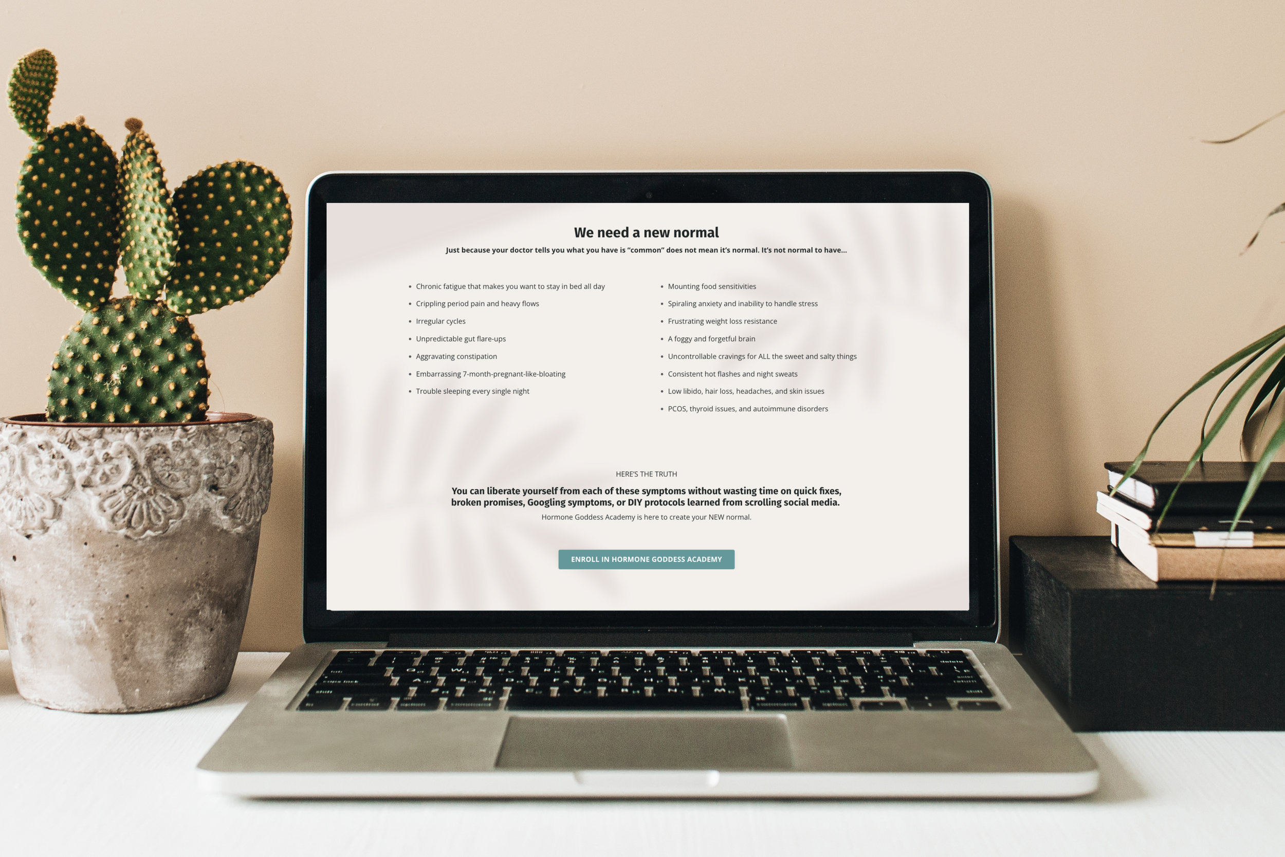
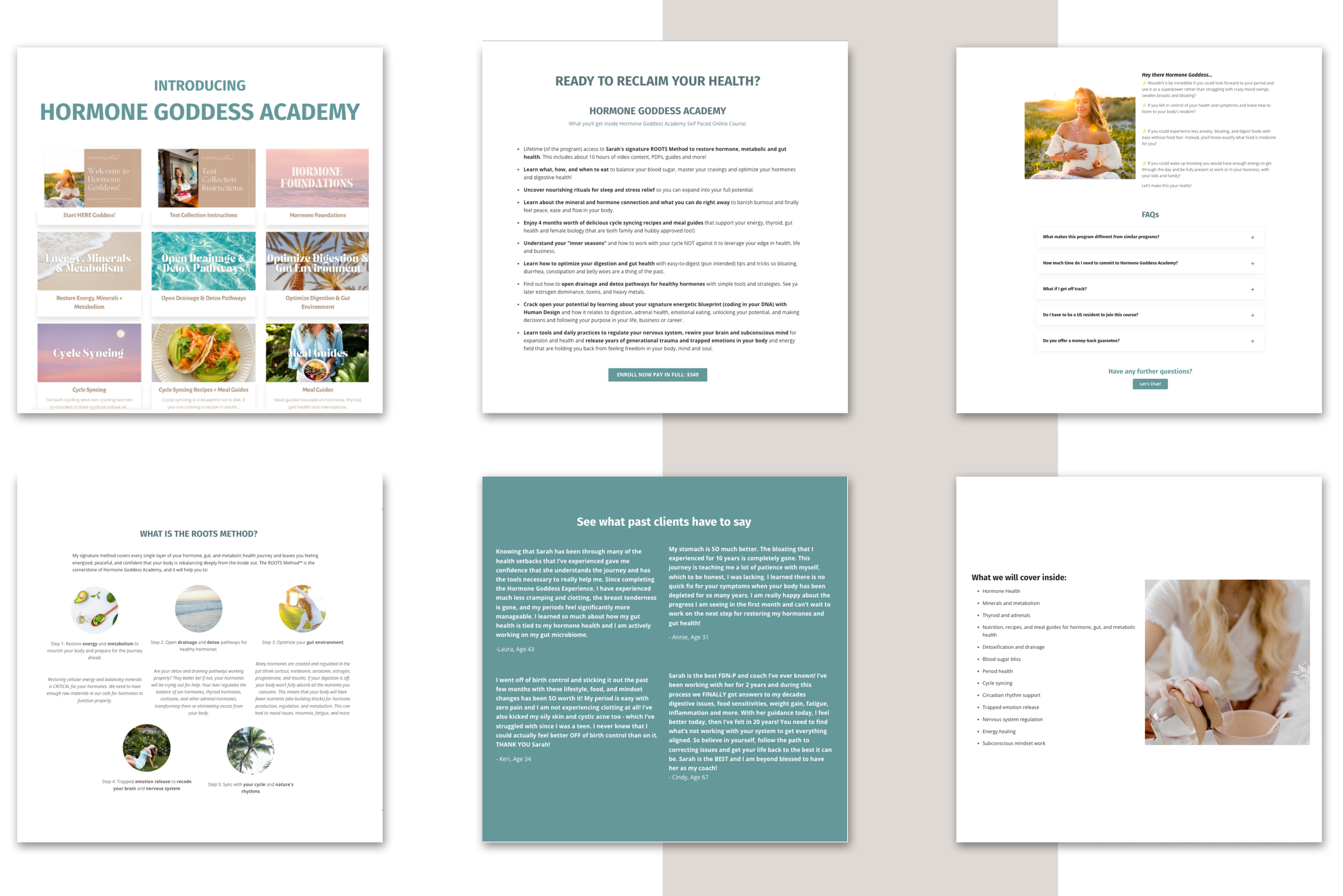
Hormone Goddess required a landing page specifically designed for a membership offering. The page needed to serve as a sales platform without being excessively promotional while still incorporating numerous calls-to-action (CTAs) and comprehensive information.
-
The main challenge was twofold. First, it involved formatting and condensing a significant amount of information into a cohesive sales page. Second, it was about finding a visual style that satisfied Hormone Goddess's desire for a look distinct from her existing website while still maintaining a harmonious overall aesthetic.
-
To address the challenge of information management, strategic copywriting techniques were employed to ensure the landing page effectively conveyed essential details without overwhelming visitors. Additionally, a balance was struck in the design to create a visual identity that complemented Hormone Goddess's preferences while still aligning with the overall branding strategy.
-
The implemented solution proved successful as Hormone Goddess was able to effectively sell her membership through the landing page. The page maintained a professional and engaging tone without being overly promotional. The visually harmonious design achieved through a careful balance of aesthetics contributed to a positive user experience and increased conversion rates.


